Showing posts with label photo manipulation. Show all posts

Thursday, July 12, 2012

Studying Light


You've heard it before. Lighting is King in photography. One of the fastest ways to improve the quality of your photos is to learn to see and use light to create mood, texture and dimension in your images. Light (or lack there of) can make a photo or render it trash-worthy.

So how does one go about learning to see light? Well, one of my first steps toward learning about light and exposure, and how to use my camera in general, was to read Understanding Exposure by Bryan Peterson. As a beginner, it helped me sort through all of those photography terms floating through my consciousness and make sense of the exposure triangle. I loved the detailed examples, with camera settings, as well as the suggestions for practice. It's a great book for beginners and I highly recommend it to anyone starting to come out of auto mode.

But, once you've gotten comfortable with how to achieve proper exposure manually, what's the next step toward seeing and using light? That's what I'd like to discuss here with a simple little exercise which demonstrates how light, and your camera's and your subject's relationship to it, can effect your image.
So, one of the most important things we can learn about light is what direction it’s coming from. The position of your light source in relation to your subject will have a great deal to do with how your pictures turn out. The direction of light controls which parts of your subject are lit and which are in shadow.

It is important to note the shadows because photos are two dimensional and shadows provide depth and contour to objects. They can reveal texture, which can create interest, or possibly be unflattering. To create shadows, the light needs to be at an angle to both the camera and your subject. So using some degree of side lighting will accentuate form.

The range of differing angles of light are generally simplified into three main types: front lighting, back lighting and side lighting. The way that shadows fall throughout your image can give you information about a picture that flat, front lighting can't reveal. Shooting with the light to the side of or behind your subject can create an image where shadows become part of the picture. Side light and back light usually produce high-contrast images with very bright areas, and very dark ones.

In each of the images below I kept my camera settings exactly the same and they were all taken within a matter of moments. The only thing I changed was my position in relation to my subject and the light.

You can see from the pull back that I had some window light from one direction, an open door from another, and a flashlight aimed at the subject.


You can see how the texture, shape, and color change from image to image and how that effects the mood of each photo. These images show how dramatically different your image can be by simply changing the angle and direction from which you shoot. (All images are SOOC except for resizing for the web).

This simple exercise can help you learn more about light. Give it a try like I did by simply walking around your subject and shooting from different angles. It will help you become more aware of how light effects your subject. By learning to use light to convey depth, form, texture and mood your images will become stronger.

Photobucket

Friday, June 29, 2012

How to Create a Matte Effect in Photoshop


Photography is one of those things that continues to evolve week after week, month after month, and year after year. It seems that for a while, every where you look there are photographers trying to emulate and replicate images that the other has shot. One key element to remember, however, is that each photographer has their own sense of style. Rebecca talked a bit about Finding Your Style in her post on Wednesday and how just because you are visually drawn to something doesn't mean that you have to commit to it.

Once I mastered the act of using my camera in manual and taking advantage of how my camera worked, I knew that I needed to figure out what kind of images reflected who I was an artist, both behind the camera and behind the screen during post-processing.

I love light. I love the natural haziness and mystical awe created by beautiful sunlight.

Unfortunately, here in Alaska that gorgeous sunshine and golden hour of photographic bliss that many professional talk about is rare. And when it does occur, it's often late into the evening (think close to midnight during the summer) or in the wee hours of the morning (3:00 am photoshoot anyone?).

I spent hours looking through the image galleries of photographers like April Neinhuis and Jenny Cruger. They both created the type of image processing that I adored and hoped to recreate in my own way. After hours and hours of playing in Photoshop and browsing the Clickin' Moms forum, I found a way to replicate that style that I loved.

Please keep in mind when doing any kind of post-processing that it's best to start out with a  properly exposed image and a good clean edit. No amount of post-processing can save an image that hasn't been properly exposed. 
 I start out with my SOOC (*straight out of camera) image:


I do my routine clean edit using a variety of self-made actions and workflow actions from Florabella:


Notice that in my clean edit I slightly over-exposed the skin. That's because the matte effect I'm about to create is going to darken the highlights in the image and bring the skin tones back down to a more appropriate level.

There are several ways to create the matte effect in Photoshop aside from using pre made or costly actions. The two methods I use involve the curves layer adjustment or the levels adjustment. Today I'm going to teach you how to create the matte effect using the levels tool in Photoshop.

When using the levels adjustment, we're going to adjust the output levels. As you can see in the example below, simply adjusting the output levels makes the image lose a bit of clarity and sharpness. It can also easily wash out color and contrast. 


Simply drag the black arrow as pictured to the right to adjust the tone and contrast of your image. This will allow you to retain your matte and haze while still getting a good well contrasted image. 


You want to make all of these adjustments gradually. Use several layers if necessary until you achieve the look that you want. I like for my images to remain full of contrast and color with a hint of haze and matte.

The clean edit compared to my final product:


Next time I'll share how to use the curves layer to achieve a similar, but more dramatic effect.

Use this technique on your own photos? Feel free to share them on my Facebook Page or on the Paper Heart Camera Page!


Written by Courtney Kirkland

Monday, January 17, 2011

Tutorial... Anthropomorphism: Giving life to fruit.

*Update: Whoops! Sorry guys... apparently I  turned off the comments. SORRY! It's back on.

Transform your fruit into the beauty you ALWAYS knew it could be.

{The Paper Mama}

Anthropomorphism is a term coined in the mid 1700s to refer to any attribution of human characteristics (or characteristics assumed or believed by some to belong only to humans) to animals or non-living things, phenomena, material states and objects or abstract concepts.

Hey everyone! Do you think your fruit is a bit boring? Needs a little more personality? Well, look no further! Your fruit can now look just as beautiful as you are!

Today we are going to learn how to give our fruit (or, really ANY inanimate object) life. I originally found a different tutorial for this same thing here. But, as I was following that tutorial... I noticed a few things that I would like to add. Note: I use Adobe CS3

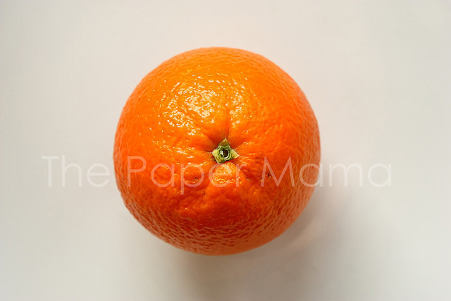
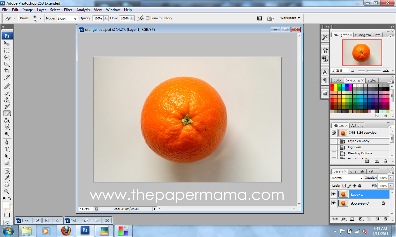
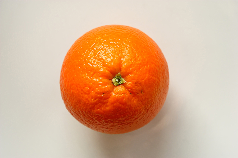
One: Start with a basic photo of a fruit. You are MORE than welcome to use my 800 x 533 orange photo by going here (once you click on that link... Right Click and choose save). Or, here's a pear from the other tutorial you are welcome to use too.


{You can click on any of the tutorial photos below to see a larger view}


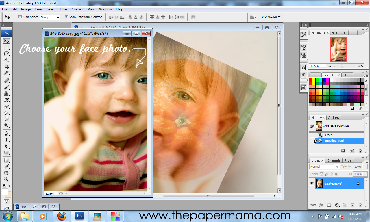
Two: Find a face photo and drag and drop it over your fruit photo. I think using a photo with an open mouth looks a little more interesting. Lower the face photo's opacity to 60%. Then, rotate and resize {Edit>Free Transform} the face photo to a position you are happy with.


Three: Using the Eraser Tool... begin cleaning up and erasing any part of the face photo that is NOT on the fruit. Then, erase and clean up the details of the face. You can raise the face opacity now if it helps.


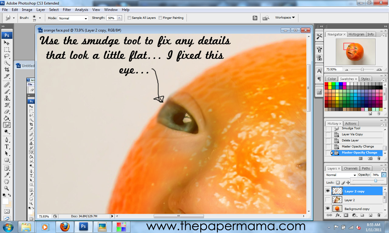
Four: Since I chose a photo that had part of my baby's eye cut off... it left a very sharp angle on the eye. To fix this I used the Smudge Tool to slightly smudge her eye so it was softer and more round.


Five: Make sure your face photo opacity is back up to 100%. Make a copy {CTRL+J} of the face photo. Hide the copied face layer {Click on the eye in the layers list}. Clicking back on the original face photo adjust the color balance {Images>Adjustments>Color Balance} of the face to match the color of the orange (or whatever the color of fruit you are using).


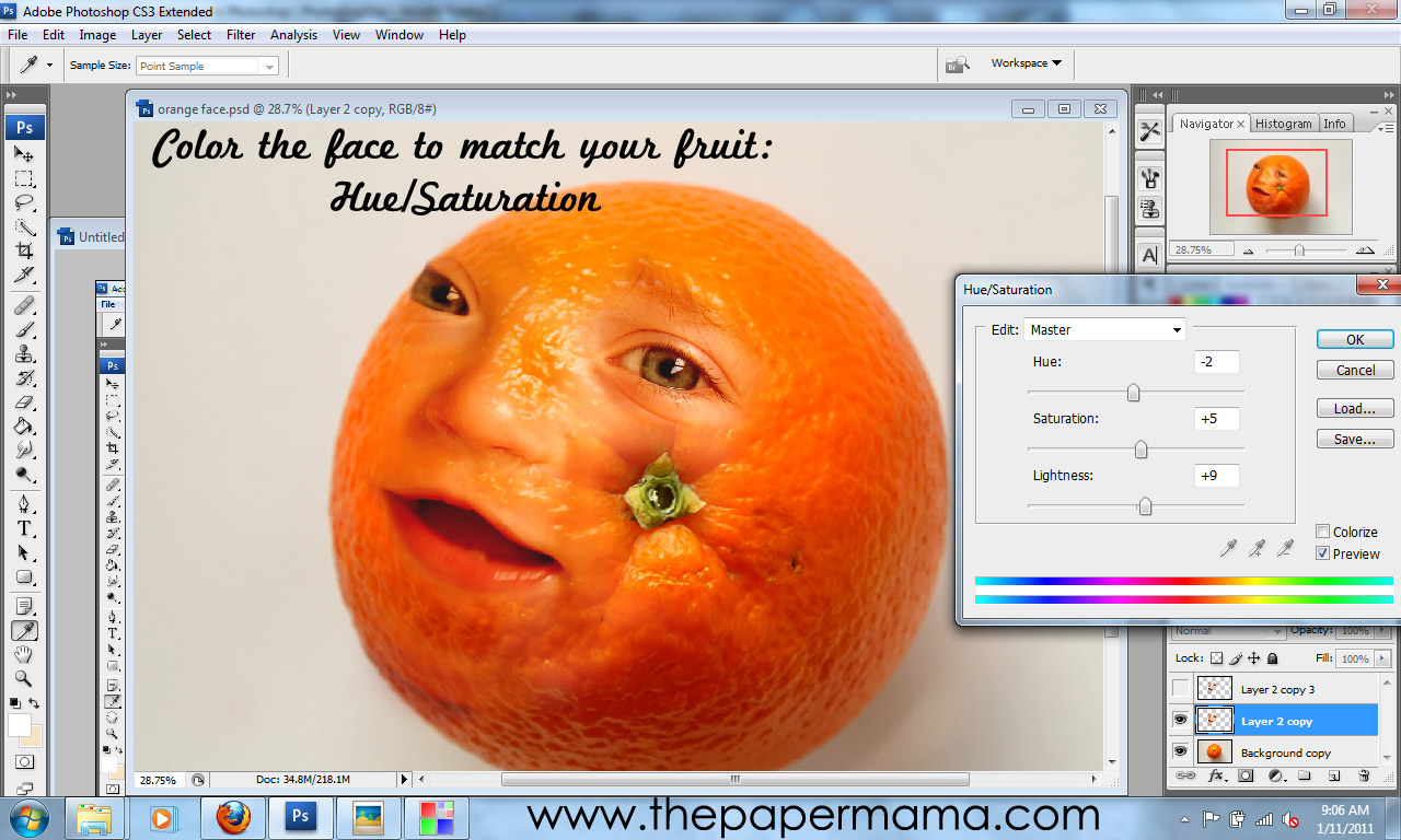
Six: While on the original face layer adjust the Hue/Saturation {Images>Adjustments>Hue/Saturation} of the face to match the color of the orange (or whatever the color of fruit you are using).


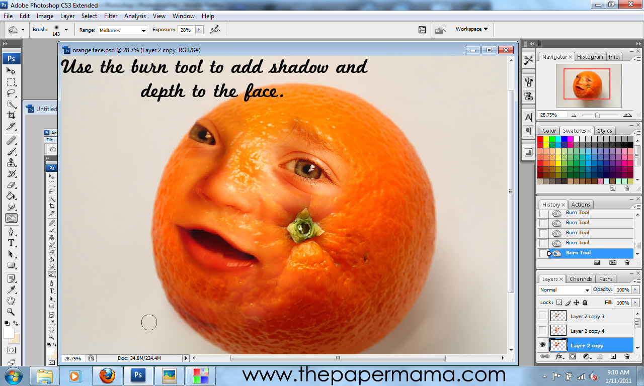
Seven: Select the Burn Tool. Adjust the burn tools exposure to about 20%. Using the burn tool add shadows and depth to the face photo. This will give a more realistic look.


Eight: Go back to the hidden face layer copy and turn it on. Use the Eraser Tool to erase everything from the face layer copy except: whites of eyes, nostrils, and inside the mouth. If you feel the eyes, nose, and mouth are a little too dark... feel free to repeat steps Five and Six on the face copy layer to your taste.


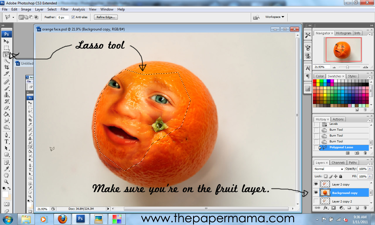
Nine: Select the Lasso tool (it's up to you which sort of lasso you'd like to use). Select the orange photo layer. Use the lasso tool to lasso the piece of fruit around the face. Duplicate the lassoed area {CTRL+J}. You should now have a copied portion of the fruit. Move this layer to the top of your layers list.


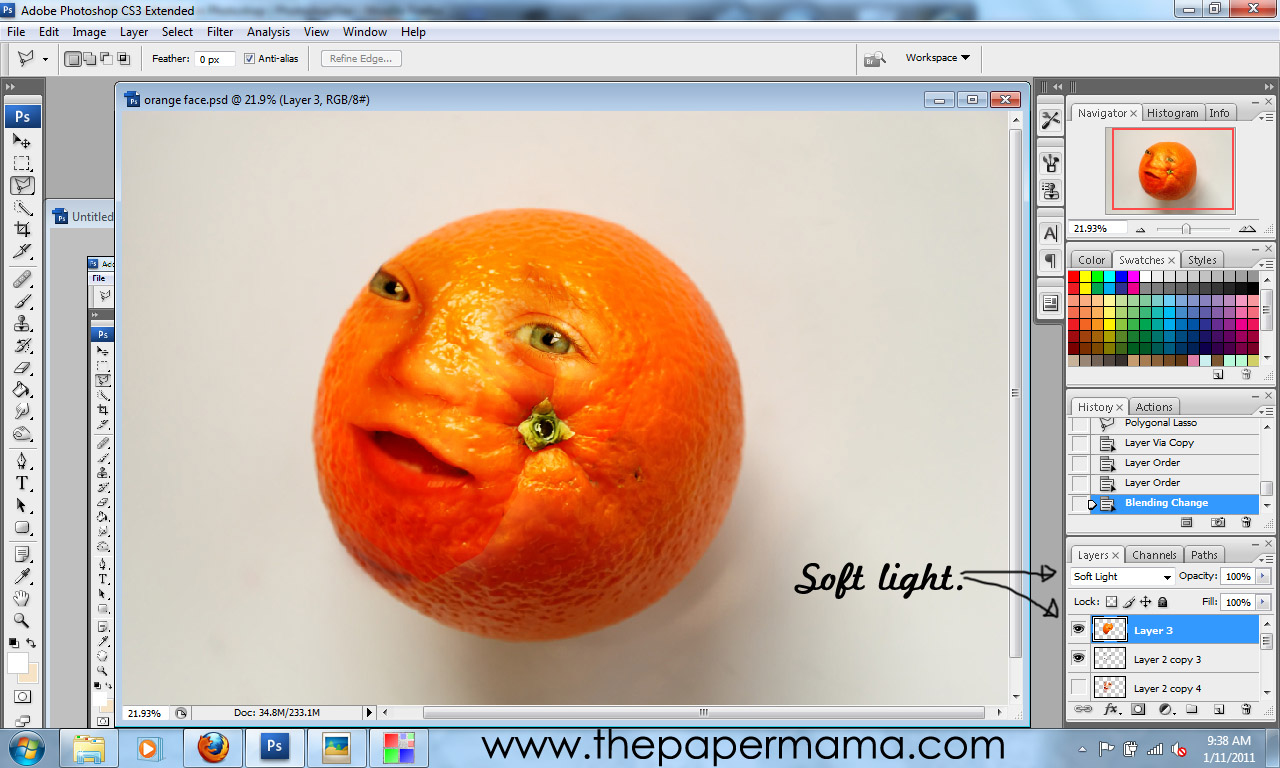
Ten: While on the lassoed fruit layer... set the blending mode to Soft Light. Adjust the brightness and contrast of this layer {Images>Adjustments>Brightness/Contrast} to your taste. Select the Eraser Tool, set on a Soft Brush, to erase the edges of the fruit lassoed layer. Smooth things out a bit.


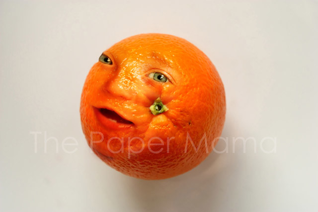
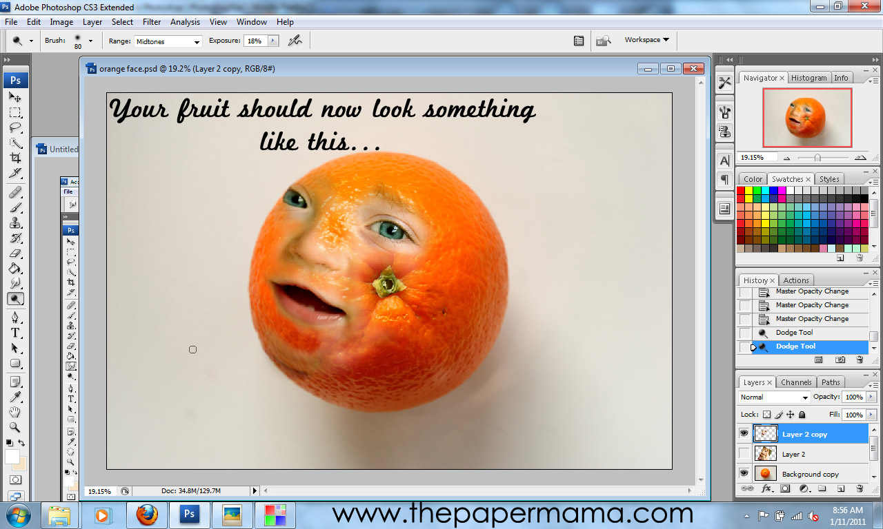
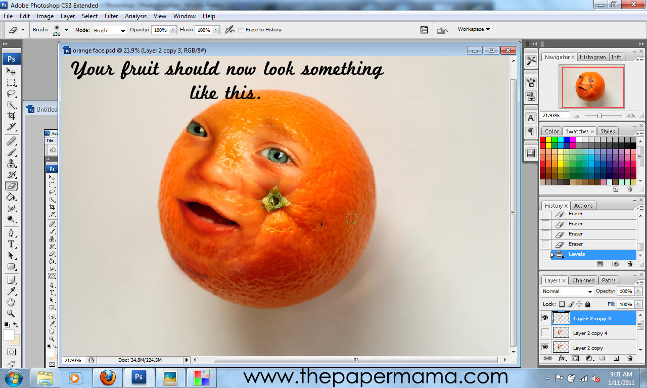
AND, you're done! Your photo will hopefully look something like this:

{The Paper Mama}

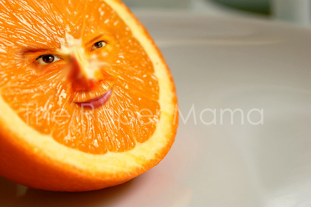
OR this... (I made an Ashley Orange version for Ashley Sisk, one of our contributors):

*Note how this piece of fruit is angled. I transformed the perspective {Edit>Transform>Perspective} of the face layer to match the angle of the orange.

OR this:

{via}

OR this:

{via}

We'd LOVE to see if you try this out for yourself! If you do... please add your photo to our Flickr group! AND, comment below with a link so we know you did. :D

Friends that have followed this tutorial: